
It is amazing to see how much web design has changed over the past 20+ years. Looking at some of the old sites will make you want to puke.
1) MSN.com – Not really known for brand identity? Well, at least in this case. This screen shot is actually from 1996.

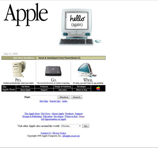
2) Apple.com – Aint actually too bad looking. This pre-dates the whole glassy looking style that Apples has been known for. Check out the HOT Mac Pro!
3) MTV.com – There is something modern about this crappy old design…could it be the Best Experienced with IE icon?

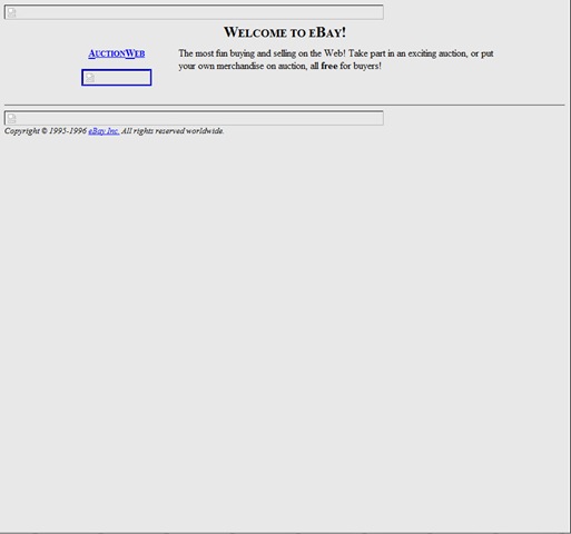
4) eBay.com – This is an old shot from 1996, which is actually missing the old logo. Still, pretty cool to see how primitive this site once was.
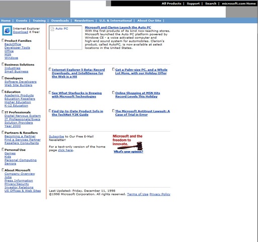
5) Microsoft.com – Goes to show you that their design skills haven’t changed much…they’ve just added blurry shadows and transparency.
6) Target.com – One of my favorite stores, known for cutting edge commercials had a cutting-cheese web site.

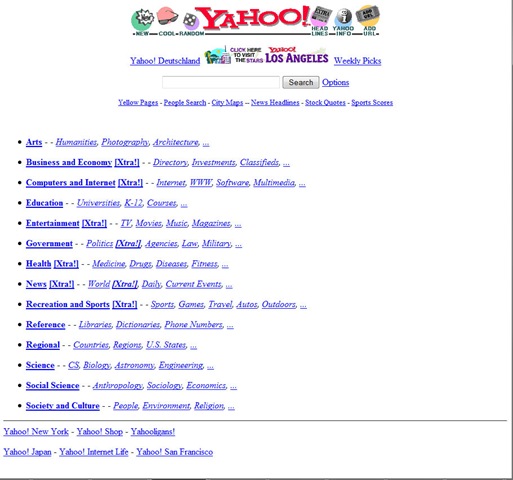
7) Yahoo.com – I love it that Google looks as simple as the original 1996 Yahoo.
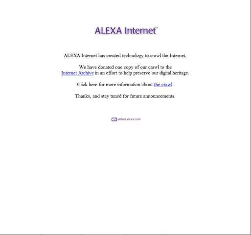
8) Alexa.com – Wow, they were really on to something with this Internet technology.
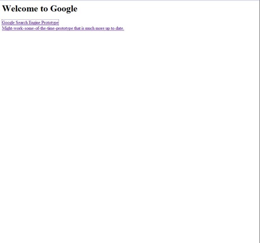
9) Google.com – I’m feeling ugly! Pretty hot looking site..even for 1998
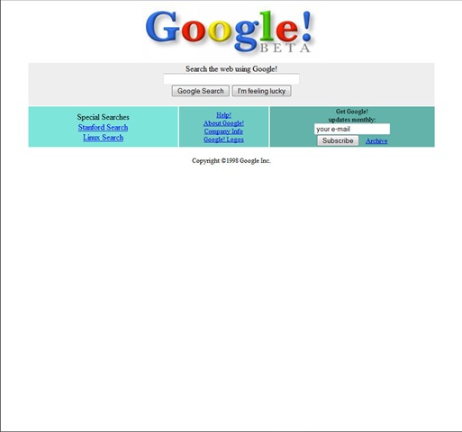
10) Google.com – One Month Later…much better looking. Nice blurry jpg logo btw:
Love the throwback website images! Man, web design has come a long way in a short period of time. 🙂
How about that MTV background with all of the action going on. Wow.
There were some pretty heinous sites back then. I’m surprised Google had an exclamation point.
Wow…i need to update this.