In a stunning turn of events, the world of BMW Championship 2024 has been rocked by recent developments. 2024 BMW Championship tee times for Friday’s second round in Colorado, featuring Xander Schauffele, Scottie Scheffler and… Read More "2024 BMW Championship tee times for Friday’s second round in Colorado, featuring Xander Schauffele, Scottie Scheffler and more"
So, I was thinking… with social media basically running the show these days, does SEO even matter anymore? I mean, if everyone’s just sharing and discovering content on Facebook, Twitter, and Instagram, who cares if… Read More "SEO: The Relic of the Past or Still the King?"
It’s a sad day, folks. I’ve fallen from my throne. I can no longer claim the coveted title of The Sexiest Man in Pittsburgh with the same confidence I once had. Why, you ask? Well,… Read More "The Sexiest Man in Pittsburgh: A Fallen King"
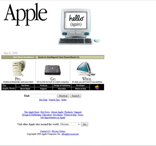
It is amazing to see how much web design has changed over the past 20+ years. Looking at some of the old sites will make you want to puke. 1) MSN.com – Not really known… Read More "Your Favorite Web Sites from Over 20 Years Ago"

Funny you should ask! I asked myself the same thing. Why? Well,I was curious as to when I should start posting cool stuff about St. Patrick’s day on my blog and Twitter feed. Anyways, St.… Read More "When is St. Patrick’s Day 2018?"
What should I write about in 2018?
So, here we are…another new year. And now you may be asking yourself, “What should i write about in 2018?” I certainly have no idea at this point. I just wanted to create a new… Read More "What should I write about in 2018?"
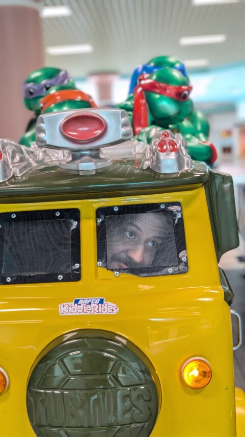
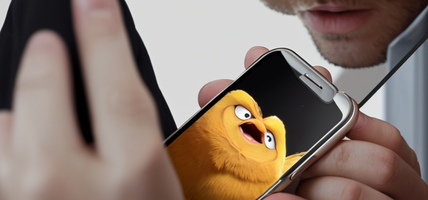
These pictures are incredibly funny. Nothing like snapping the camera at just the right moment to preserve embarrassment forever! Read More "Pictures Taken at Just the Right Time"
Ran into a snag…
Ok, so it appears that I’ve had a massive system failure that removed pretty much every piece of awesome content ever created here at TonyRocks.com. Hang in there as this will take some time for… Read More "Ran into a snag…"
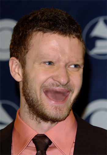
Silly stuff…cracks me up when you see celebrities with no teeth or eyebrows. Thank goodness for Photoshop for making these wonderful photos possible. Robert Pattinson without teeth or eyebrows. The silly thing about this one… Read More "Celebrities with no teeth or eyebrows – totally hilarious!"